
Introducing Lean UX
During their digital transformation (via the new Shoreditch tech hub), my focus was to evangelise a working UX process while delivering projects of varying magnitudes. The following case study explores the process developed to sell in a design thinking methodology while overhauling the most important & most visited page on the site – the Product Detail Page (PDP)
Objective
Redesigning the Product Detail Page (PDP) and addressing key service benefits would see an increase in Add to Bag (ATB) conversion rate, with the additional KPI of reducing Returns Rate, while developing a UX process for the wider team.
Role
Working collaboratively with senior stakeholders, mentoring junior members of the design team while working with existing RI customers. The whole design process for this particular case study took 4 weeks (2 sprints), starting from research to final UI deliverables (both MVP & future thinking).
Challenges
The PDP needed to inspire users into purchasing an item by showcasing it clearly and providing the necessary product and service information. It was immensely dated from both a design and UX perspective, affecting the way people perceived the River Island brand and decreasing trust in their overall service proposition.
Summarised Process
We initially ran a heuristic analysis to identify which areas of the PDP might benefit from improvement, with a focus around ATB Conversion rate and return rate.
An initial discovery research plan was formed which primarily included:
Analytic reports to illustrate the current baseline (data insights, heat maps, decibel recordings and funnel analysis)
Customer feedback from moderated user testing sessions (with a primary focus on qualitative discovery methods)
Competitive analysis to show how competitors are tackling the same issues
These exercises formed a great foundation to move into feature ideation and prioritisation. We synthesized our findings and were able to create an MVP which was presented and shared with the key stakeholders in a co-creation workshop.
We finally ran A/B tests to inform our initial hypotheses, with potential to re-address the solutions and inform the business for future opportunities.

Designing for outcomes
(not outputs)
After workshopping the fundamental stages to include across projects of various scales, we began to trial the new process (as follows). We explored both optional and required steps (depending on project) from design thinking best practices. Focussing on activities that would provide measurable business outcomes


Business Requirement Assessment
By defining the areas of assessment and identifying all the features and services that may be affected by the changes, we scored each of them based on an assumed customer benefit. We worked closely with senior stakeholders to assess business benefits and discussed the research effort involved.


We focused on actionable items that might directly affect the project KPI’s. Adapting the KANO methodology to suit the needs of a rapid prioritisation process proved beneficial when working with senior stakeholders with limited time.
Hypothesis generation
Upon scoring and prioritising the key features & services we selected the top items (quick wins with largest business impact) to focus our research. We then created hypothesis statements as a way of expressing assumptions in a testable format, followed by recommended research methods (senior stakeholders were kept informed throughout the process).


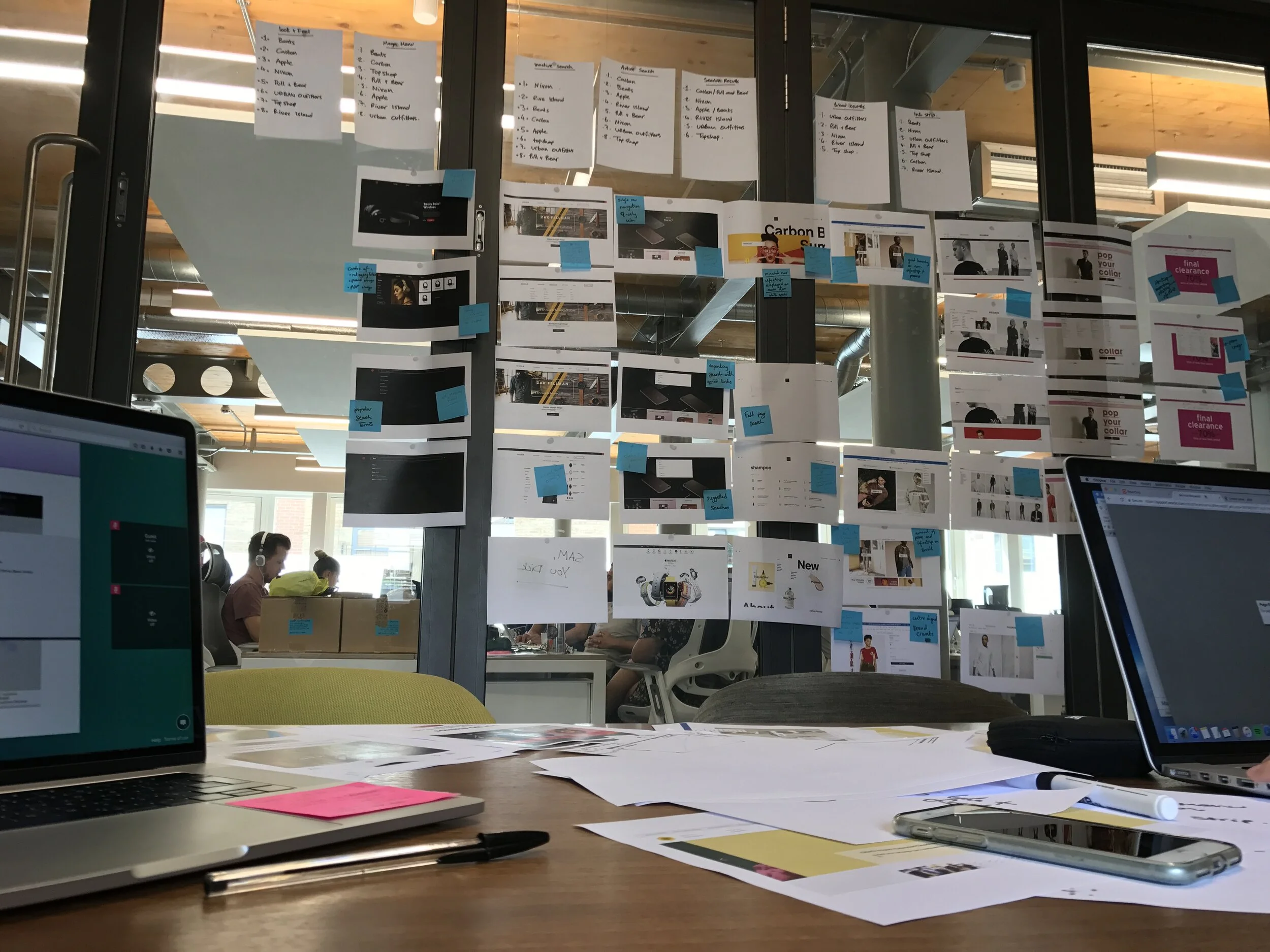
Myself and fellow colleague Gianluca Cherubin occupied a ‘war room’ for the duration of the process
Data Driven Analysis
When reviewing how people were interacting with the PDP through aggregated heat map analysis (of set durations) and masses of session replays, some of our highlighted discoveries included:
A customer expectation for the image to zoom when they clicked on it. At that moment, this functionality wasn't available (highly important for reducing returns KPI)
A high volume of customers would interact with multiple colour swatches. Combining this insight with Google Analytics, we found out that 50% of the PDP visits were coming from a previous PDP through the colour swatch (as opposed to ‘related items’, which would later inform design decisions)
The quantity selector was sometimes mistakenly considered as the size. In addition, analytics revealed that very few transactions involved multiple items with the same size (which later informed our add to bag design exploration)
The "Wear it With" functionality (cross-sell) was not widely used and could potentially distract customers.


User Research
To further investigate the behaviours found in the data analysis, we conducted direct interviews with customers. We also wanted to understand what information the customers were prioritising when interacting with the PDP, how easily they could complete specific tasks, and highlight their pain points (to include in our potential areas for optimisation).


Selected Interview Findings
Participants expected all items the model wore to be available to buy within the same PDP
Participants preferred to look at specific views (front and back of item/model). Initially these were ordered first and third in the thumbnails (requiring an additional click)
Participants tried to select the quantity initially, thinking this is related to the size of the item (Part of ATB interaction optimisation)
Participants forgot to select their size before adding to basket (Part of ATB interaction optimisation)
Participants were not using PDP delivery and return area to find information, instead opted to check the footer for specific pages.
Participants were unsure of delivery costs, especially in regards to hitting basket quotas to qualify for free delivery

Consolidated research outputs


Highlighted extracts (informing stakeholders along the process)
Competitive analysis
To support the research, we analysed 5 direct competitors (Topshop, Missguided, ASOS, Boohoo, Zara). As part of this analysis, we marked competitors across the same features/services to use as snapshot for future benchmarking. Selected findings:
ASOS provides Catwalk videos in addition to the ability to scroll through the images
Missguided included the model's names in the product description, which allows customers to find and follow them on social media
On Boohoo and Topshop, swatches are instantly shoppable and colours are an option of one product ID
ASOS Buy The Look functionality allowed customers to shop the whole outfit the model was wearing from one page
Boohoo includes "People who view this item also like" – recommendation based on other visitors behaviour
Online Survey

We utilised the traffic of the RI site to launch surveys. This allowed us to acquire quant data to help validate the supporting qual research
Customer Support Team
We visited the customer support team in Manchester as part of a wider communication initiative for ongoing projects. This offered valuable insights to some of the primary customer pain points, and proved to be a useful relationship building exercise between the design department and wider business

Design Exploration
Utilising the the discovery research we began to synthesise the data to inform new design explorations and focused on areas tying back to the primary project KPI’s (increase ATB conversion and reduce Return Rate). The following examples include design explorations optimising the add to bag interaction pattern and a new feature proposal (smart delivery bar)


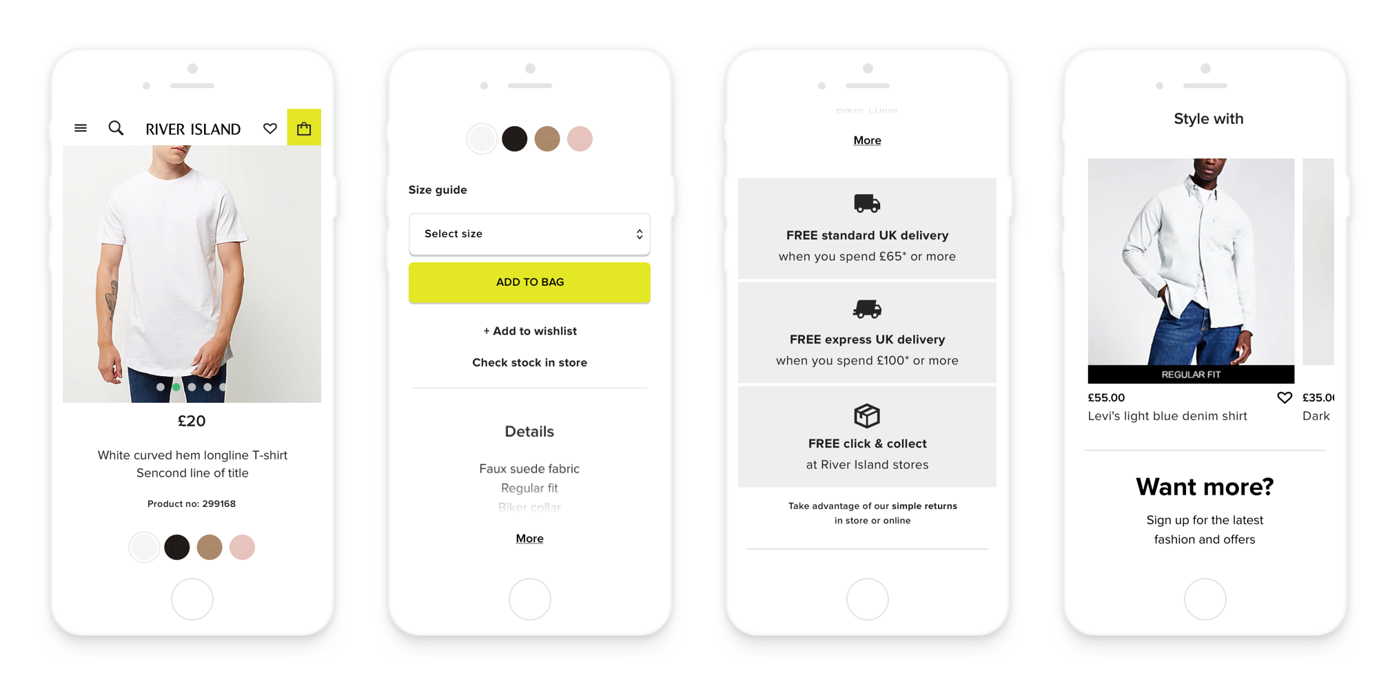
Add to bag
Insights
Data analytics revealed that people buying multiple products are more often buying different sizes rather than multiples of the same size
During user testing, participants tried to select the quantity initially, incorrectly assuming this controlled the sizing
Solutions
Sizes displayed in a grid view gives clear visibility of what’s in stock
Removing the quantity selector simplifies the interaction (focusing on sizing only)
Introducing additional smart interactions helps inform customers without cluttering the design (for out of stock, or unselected sizing)

Smart delivery bar
Insights
During the testing customers would often miss the delivery information and the participants that found it didn’t feel like it was informative enough
Test participants revealed they would be more likely to purchase additional items if it meant they would get a better delivery service
Solution
Returns and delivery costs should be highlighted due to frequent tendencies of fast fashion shoppers to act based on these services
Creating a “smart” info bar which dynamically updates during the users’ shopping process will encourage a larger spend while also informing customers about delivery/return services

4x Smart delivery bar states
Proposed Rollout Plan
We delivered the project by proposing updates in phases (framed as bronze, silver & gold). This allowed us to provide recommendations to individual elements of the existing site (for MVT) while also exploring a conceptual best in class design to aim toward in the future (encompassing learnings on the way)

Stakeholder co-creation workshop (exploring concept page)
Old Product Detail Page

New Desktop PDP (MVP)
New Mobile MDP (MVP)
PDP Concept

Conclusion
We ran an MVT’s against the current version (baseline) for approximately 3 weeks.
Redesigning the PDP with a cleaner layout significantly increased the number of product pages viewed on mobile by +4.16%
The number of returning visitors arriving at the bag increased by +3.23% on mobile
The number of visitors interacting with the swatches increased by +12.63% on mobile
Returning visitors on mobile were the best performing with a +2.07% uplift at purchase
Redesigning the PDP with a cleaner layout significantly increased ATB conversion on desktop by +3.25%
Engagement with the sizes significantly increased by +3.02% on desktop
The number of visitors engaging with the swatches significantly increased by +16.65% on desktop
10.17% of visitors engaged with the new full page desktop zoom functionality
Tablet users were the best performing segment with a +4.67% uplift at ATB conversion
The information we collected from the test provided us with opportunities to investigate further:
Moving the Cross-sell functionality down the page reduced distraction by 70% as our primary and secondary metrics have increased
Only 0.23% of visitors in the variant clicked to add an item to Wishlist
